Logo Design
Not2Nay - Personal logo and branding
The inspiration for my logo was a life long desire to make my name easier for people to pronounce. The phonetic logo has gone through several design changes as I’ve grown as a designer. The rounded letters and bright, soft yellow speak to my warm personality, and the muted tones of gray add a tone of modern professionalism.
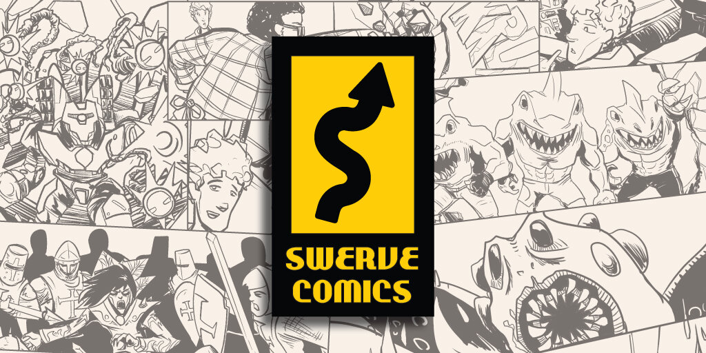
Swerve Comics - Logo and branding
Swerve Comics is a comic collective started by a few close friends. The Swerve brand is built on “out there” stories, stories that take an unexpected turn. I was inspired by the “winding road” road sign, and incorporated an S shape into the logo. Considering the common placement of publishers’ logos on comic book covers, I opted for an overall rectangular shape, but highlighted the design with caution yellow, to tie it back to the original sign design.
Feature 3
Dusing Digital is a visual media production company founded by Dan Dusing. I worked closely with Dan in the early sketching stages of the logo design to ensure that we hit the right beats. He wanted a logo that combined the alliterative typography and worked both in color and grey scale. The overlapping D’s invoke the image of a camera’s shutter.


